Tuesday, August 4, 2015

Drawing Watercolor Cartoons- Halloween Witch


I was in the Halloween mood lately so I decided to have some fun with the concept and create a watercolor picture to match. For this one, once again, start with a pencil sketch, then go over in pen. To give it the spooky look requires adding A LOT of detail, such as adding the grain of wood on the house, the swirls in the witch's cloak, and drawing every blade of grass. It can become tedious, but this helps give an older look, so I suggest watching a movie to distract a little from the work. Halloween pictures tend to lean towards the unusual, so you want to add at least one interesting aspect to catch the viewer's attention, such as making the witch larger than life, just enough to make the viewer look twice. Then finally, stick to autumn colors, browns, and purples and oranges work great, even green, if you can find the right shade, to give it the picture the festive look of sneaking around on Halloween night.

Wednesday, July 22, 2015

Get to Know the Artist- Bill Watterson, Calvin and Hobbes

Today I am starting a new subject in SavvyArt, where I'm going to be comparing the distinctive styles of different artists by drawing similar to their published works and talk about the different methods you can see being used by that artist. So, for my first one, I'm going to start with a fun one, cartoonist Bill Watterson's Calvin and Hobbes.

Watterson, Bill. "Calvin and Hobbes." N.p.: n.p., n.d. Print.

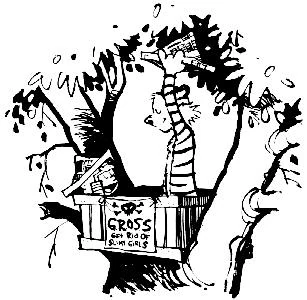
Calvin and Hobbes has always been a favorite in my house to rouse up the giggles of an adventurous boy with his stuffed tiger for a friend. But now that I have come to view the comic from a more artistic point of view, comes the idea to learn to draw the characters and scenes from these comics. So I have taken one of the illustrations from the book and have worked to mimic its style, and added my own finishing touch.


For this painting I did have to use a bit of an artist's license in order to fit the entire square illustration onto a rectangular page, making Calvin and Hobbes a little more equal in height, and adding a couple more leaves in the background and the title. It does take some time to draw the characters in the immediately recognizable form as the original artist can do, but don't get discouraged! The way it is specifically drawn is all part of the expression of the artist.

Now, for learning from the artist, Bill Watterson, in this case there are a few things you can take notice of from learning to draw in his style. His style, being a cartoonist, is somewhat impressionistic, especially in the textures he implies. (notice the round curves around the right branches and the black leafy background on the tree) In drawing the characters you find that their proportions are surprisingly specific if you want to get them right. (Notice how tall Hobbes is in the original illustration in comparison to Calvin) bringing out how specific Watterson gets in drawing his characters. As his work was made primarily for the funnies section of the Sunday paper, this is little shading involved, black and white with little in between, giving it a simplistic look. That is, until you try to draw it. Hats of to Bill for the dedication of keeping the funnies coming for ten solid years.

I hope you enjoyed this side to side comparison of this artist, and if you have any suggestions on any other artists I should do next please leave them in the comments below. 


C

Thursday, June 25, 2015

Photography-Adding A Quote


Using your photo to display a quote is always a fun way to test your ability in photography, so let me give you a quick run through of how I got to this point.


It started with a simple heart I noticed that someone had drawn on the ground that I, being the trigger-happy photographer I am, decided to snap a photo of. But the heart was faded, the stone is far from presentable, and the dirt and pine needles distracted from it, so it was going to need a little help.


I fiddled around with some of the settings and effects (the one above being one of my saved tries) until I found that the reddish tinge went well, and when I cropped, to put more stone in than cracks. Another challenge  was picking out the corresponding quote. Yes, I know there are a lot of fun quotes out there, but you want to try to stick with one that matches the image. Finally, after a lot of messing around with lightness and highlights, I winded up having to go over the heart specifically with brightener to match the chalk text, and that made all the difference. 

Photography-Continuous Collage


I had time to mess with my camera setting during a rainstorm when I came upon the "continuous" button on my Nikon. It takes rapid pictures that create a moving flipbook. I inserted some of them into a collage format using Plixr editor, creating a neat display format. Make sure that the photos stay in the same format and position, especially in this square model.

Wednesday, June 24, 2015

Photography-Creating An Unicolor Photo


Making one of your photos into a unicolor one is very simple, most photo editing software will have that option, or you can simply adjust the color setting yourself with a little messing around in the RGB formats. But deciding whether or not you should convert the photo to that format is a different story. For one thing it tends to need to be a simple photo, one that you could easily make into a silhouette if you chose, otherwise the sole color would probably make the photo too busy. Also the single color you choose should somehow reflect in the original photograph for a more believable appearance, such as the sky, in this case, expanding to reach the trees.   

Painting-More Pen and Watercolor with Crosshatch


I have recently purchased a new watercolor sketchbook and had fun making use of it's pages. The pen and watercolor technique are simple and easy, even on the go, and I had fun applying the crosshatching technique to it. I would recommend trying it with an actual photograph or an internet photo to compare the lights and darks for the crosshatching. Check out all the rest of my work on my Pinterest Account: https://www.pinterest.com/savannarstewart/

Tuesday, June 23, 2015

Painting-Mixing Landscapes with Abstract


Now that it is summer, I have decided to work on my acrylic landscapes. For this one I used a bit an abstract look by adding an orange sky to contrast with the blue water. I used a fan brush to add the grass, trees, and white flowers and waves on the water. Make sure for this project to add less detail to the trees, flowers and such the farther away they are. Don't be afraid to use your own fingers for the final touches, like the snow on the mountains. 

Photography- Moving from Background and Foreground


One of the best ways to draw the viewer to the photograph is to give the picture depth, and to do that, you need to learn the areas of a picture. One is called the background, the area of the photo that the viewer can tell is far away, the foreground, what you can see as up close, and the middle ground, what is in between the background and foreground. In this photo, the sky would be the background, the tree in the front is the foreground, and the trees behind it is the middle ground. Like in a previous post, the natural lines in a photograph,  it directs the viewer, except in this case it directs the viewer to the background. Seeing the foreground grow smaller up to the background gives it the realistic perspective.

Wednesday, June 3, 2015

Photography-Scenic Landscape

 
This photo of a day at the lake was actually taken by a stone age cellphone, if you can believe it. Scenic scenes should often allow your eye to wander, taking a few minutes to notice the details of the picture, such as the people on the right by the tree or the canoe in the lake. To do so, the lines in the photo should lead your eye to a certain target, then guide your eye to the rest of the picture, and it doesn't have to be exact. For this photo, the tree-lined mountains and the jet streak in the sky leads your eye right to the snow capped mountain, making it the first thing you see. Then, the dam and the coastline brings your eye back to the foreground, allowing your eye to pick up on details.

Crafts-Art Journal 3

 
One of the best uses for art journals is expressing your likes at the time you are creating it. That way, you can remember favorite books, movies, and memories when looking back on it. To make it even more special, you can even try switching things up a bit by doing the scene in a different style than it is originally seen. For example, for the "Harry Potter and the Sorcerer's Stone," I made the key scene with scrapbook paper, pen, and watercolors, writing the book title in the far corner with a calligraphy pen. I even decided to add some gold glitter for the magic effect.

Monday, June 1, 2015

Drawing- Sharpies on Posters- Dragon


Drawing on posters requires three things, a poster board, a sharpie, and a lot of patience. I did this for a friend on a poster cut 12 x 12 inches and even with the smaller space this drawing took almost three hours, primarily spent drawing repetitive scales on the dragon. I would recommend using permanent marker, (I used the fine tip)  but to do a quick sketch in pencil first. I added a bit of crosshatching on the bigger parts, such as around the eyes, the wings, the tail, and the larger scales. Just remember- An artist is not someone who doesn't make mistakes, but someone who can make them look good. If you make a mistake with permanent marker, you can't erase it, but you can fix it to look like something else in your painting.   

Friday, May 22, 2015

Painting- Using An Artist's Knife In Acrylics


When doing painting on a canvas, a lot of texture is envolved in creating an image with the paint. Most painters you see use brushes, but recently I have decided to try out a diffent way, using a tool called an artist knife. The orgin of its name escapes me, it seems more like a thin spatula or a small cement scraper when it comes down to it, but I found it to be a remarkable little tool in creating a wavy sort of texture with the paint. 


As it was my first painting and attempt to use a knife, I kept it simple. I did a sky and a black and gray hilly landscape using the knife, (which I found tends to use more paint) then added the tree, girl, and the lights with a brush. 


Wednesday, May 20, 2015

Crafts-Scratch Board


Scratch boards are a combination of crosshatching and working in the negative to create a picture. For those unfamiliar with what a scratch board is, it is a thick sheet of paper covered in dried ink that you scratch away at to reveal the paper behind and create a picture. Here are the steps for not only doing a scratch board, but also how to transfer a sketch to the board.


Start out by drawing a simple sketch of what you want to draw. For example, I chose a scene from the book "Miss Peregrine's Home for Peculiar Children," by Ransom Riggs. (A very good book) Then once you are done, turn the page over and cover the back in pencil and, if you want to save time, place the drawing on a light board and cover only where you drew in the picture. The outlook should look something like this:


Then take the scratch board, and cut if needed to make sure that the sketch paper and board are the same size. Line the two papers up, and tape on one side to ensure they won't move. Then, with the sketch face-up on the top taped to the scratch board on the bottom, retrace the sketch over. If you shaded the back dark enough the graphite will rub off, creating a replica of your sketch on the surface of the scratch board. Now all you have to do is scratch! I used a scratch tool that you can find at your average craft store (seen in first picture) and more likely than not they come with the board. But if not, any toothpick or chopstick can do the trick, even a fork. Remember, in a scratch board, you are making the LIGHT parts of the picture, the opposite of drawing, where you are making the DARK. Use crosshatching to make the lighter and darker shades, and once you remove something, you can't get it back! When you are done, it should come out something like this:


Tuesday, May 19, 2015

Crafts- Art Journal 2


You don't have to even be a good artist to keep an art journal, you could simply create a collage of magazine clips you like, and add whatever you like for decorations, from stickers, to string to wrapping paper. Here, I just jotted down some sayings with a calligraphy pen and glued it on top of a collage of stickers, tape, and wrapping paper. It's that simple.


Wednesday, May 13, 2015

Painting- Watercolors with Crosshatching- Hot Air Balloon/Girl With Light Bulb


Now that we have learned a bit about crosshatching (see previous posts) let's take it to the next level, color. For this painting, I first did a sketch with pencil and in a thin Sharpie, then colored it lightly in with colored watercolor pencils. A few splashes of regular watercolors with a bit of mixing is all you need. Here below is another example, what your subject can be is nearly limitless, so use your imagination.


Crafts- Art Journal 1


Art journals are a way of expressing yourself, and, if you are a doodiler like me, it helps keep down the clutter of paper. What is so fun is that it can be so personalized to what you want and using what you have laying around the house. I am using an ordinary composition notebook, and cover the pages with scrapbook paper. I will keep putting my best pages on here and write a bit of how I did it, and hopefully if the notebook spine doesn't burst, I can continue to do them until I finish the book.

This one is a silloette job that took a great deal of cutting, and with the old looking paper behind it with the clocks, the expression "time flies" comes to mind.

Sunday, May 10, 2015

Painting- Mother's Day Watercolor


Mother's Day us here! And for a cute gift I did a watercolor for my mother of her favorite flowers. Its a big combination of watercolor pencils, pens, watercolors, and ink and is so fun and simple to do. First, draw a simple outline sketch of a bouquet of your choice, (key word being simple, the pencil can show through watercolors) then retrace with a thin black sharpie. Use your watercolor pencils (Prisimacolor works great) and lightly color in the flowers and leaves. Go over the painting with water to blend the colored pencil, then go over it with regular watercolors to add highlights, extra color, and a background. Don't be afraid to mix them! Finally, with green ink and an eyedropper, I added some ink spots, dabbed away the excess, and blended it in to give the picture some extra color. Add a couple of splatters with the watercolors, and your done! Happy Mother's Day!

Thursday, April 30, 2015

Drawing- Cross Hatching


Shading, especially for something like a face, can add more depth and accuracy to any drawing. One of the more popular ways being a technique called crosshatching. This is when you use parallel lines overlapping each other to create a shadow in the picture. The closer the lines are to each other, the darker the shadow. For a drawing such as this man right here, start with a basic stetch of the position of his eyes, an outline of his face and suit, etc, then continue the drawing by showing the lights and darks. (I would recommend starting with a black and white photo.) It becomes even more interesting when you see it from a distance, and you can't even tell that they are lines!


Friday, April 24, 2015

Crafts- Pressing Flowers


Pressing things is super easy, (all you need is some flowers and a heavy book) and a fun way to preserve spring's beauty for the coming seasons. Simply grab some fallen petals and carefully lay them in a large book to dry for a few days and your result will be perfectly flattened petals for pasteing in journals and books, fragile, but perfectly preserved. (Please note that you may want to use older books as the flowers are likely to stain the page where they are pressed.) The two types of flowers I have been experimenting with are irises and poppies. My best luck has been from the irises, which look pleasantly more like watercolors than flowers when pressed. But with so many flowers to choose from, you can easily have a whole garden of petals.


Crafts-Shadow Box

Shadow boxes are a great way to decorate your walls and maybe rid yourself of a few odds and ends and still make them look attractive in your very own boxed collage. It is very time consuming, and in order to be able to change or alter it later, I used double-sided tape to insert all pieces into the box. After a bit of trial and error, I have found that paper of all kinds, magazine clippings, fabric, string, leaves, cork, buttons, wood, and metal, such as pennies and small gears stick surprisingly well. While fabric flowers, shells, (even small ones) wax, and lace not so much. To find the odds and ends to do this project, I kept a small jar on hand so whenever I came across a wayward penny or button, I placed it in the jar to sort through later. As for the rest, try looking in jewelry boxes or little-used drawers to find extra game pieces and pendants from jewelry to add to your collection.  To make it look extra nice, try buys a few dollars worth of scrapbook extras and charms to add the final touch.


Wednesday, April 1, 2015

Photography- Background and Foreground


Like painting, background and foreground allows the viewer to see depth in the picture. Photos like this has you first focus on the foreground, (aka the big yellow blossom) then slowly look farther back. Make sure the most detail and focus is on the foreground. Like real life, viewers should see the foreground the sharpest and the background should seem slightly faded.

Photography- Framing


This style of photography is tricky to set up, but works great at the right angle. The picture really says it all, it naturally draws the eye to the center. Take note that, if you can, try to make the center focus lighter than the frame for the full effect.

Photography- Layering Roses


A simple way to capture a good photo of flowers is to layer the photo so that the flowers line up and directs the viewer all around the photo. To do that, find a bud that looks especially photogenic, like the big pink rose, then find an angle where some others flowers can be seen somewhat in order in the background. A bit of skill in saturation and the flowers just pop.

Photography- Rose Intro


Spring is here! The flowers are blooming, the sun is shining, and for many photographers out there, spring means photos! So here are some tips and ticks for capturing some good flower photos, and make sure to check out my Instagram for some more photos! @Savanners

Monday, March 30, 2015

Crafts- Paint Sample Banner


Its Springtime! And springtime for most crafters means redecorating. I've noticed my room seemed a bit dull, so I found a cheap easy way to brighten it up, from Pinterest of course! I went to Lowe's and found some paint samples in the shape of flags, even with a hole in one of the top corners, and brought them home. One hole punch and an bit of threading through and done! One cute banner to hang anywhere!


As you may be able to tell from this close-up, there is a little bit of text on the flags, but they are small hand hard to notice. Still, it helps complement the colors of your room and really pops against a dull white wall.

Thursday, March 26, 2015

Photography- Silhouettes


Silhouettes are always fun to do when in a group. Everyone can take turns being king-of-the-rock while everyone else cheers them on. If they are standing, try to have the camera level with the subject so that their silhouette doesn't seem warped in the light. If they are sitting, try fixing the lens so that you are looking up at them, don't worry if you have to squat to do so! As for the editing, try adding some more color to the image.

Photography- Kids Part 1


Photographing people is all about the timing, especially when kids are involved. Because of the many aspects that can effect the photo, I find it a good idea to take multiple pictures in a row, and hopefully, you can get at least one good photo of your fidgety subject.

Tuesday, March 24, 2015

Crafts- Spay Paint Pickle Jars


This week I experimented with spray paint by decorating a pickle jar, which turned out to be easier than you would think. I simply cut a trash bag in half,  weigh it down on a flat surface in a well-filtered area. (Preferably outside) For the top I found it best to spray in an circular motion, the sides are particularly difficult, but be patient! If you touch it a minute too soon, you have to start all over again. Make sure when it dries its not sitting in a pile of paint. And don't trust the time they give on the can fornhow long you should wait to dry. For mine I used a nice pistatio green for the vintage effect and tied some string for the final touch.


Monday, March 23, 2015

Photography- Focusing On the Good Aspects- El Paso Skyline


In photography, sometimes you have to change your definition of a good photograph to suit your position. This for example, wouldn't be the best place to show the city of El Paso, but, as it was a rainy day, it did have some good aspects to it, like the rainclouds above the city. So, for this picture, I focused on the clouds rather than the city. 

Photography- Following the Line- Cactus Garden


Lines can be used in photography to tell the viewer where to look. This shot, for example, has two groups of lines in the bricks. On directs your line of vision up and down the image, the other goes horizontally, directing your attention to the catuses and away from the brick.

Photography- Close Ups- Poppy


Close up shots are always an ideal way to capture small details of individual shots. It requires alot of focus on the one object, such as this poppy, and in your editing and actual shot. You need to make sure that the emphasis is on that very object, and in some cases, grayscaling the photo can help it stand out.

Photography- Poppy field


  1. :
    This weekend I went to see the Mexican poppies in El Paso, it had rained earlier in the day, so the were only partially open, making for a more interesting shot. The trick with capturing a group of something, like these poppies, is to make sure you have objects of focus in both the background and foreground, or the photo will appear flat. You can check out all my photos on my Instagram @Savanners 

Wednesday, March 18, 2015

Drawing- Sending A Message- Robot With A Flower


Art is often highly influenced by the message it represents, like the lyrics to a song. And sometimes, like this drawing, the message is its strongest feature.

Painting- Dragon Tail


Imagination can do wonders in art, and this watercolor is a good example. By showing only the tail is leaves the rest of the dragon to the imagination of the viewer, and the drawing can be interpreted differently by different people. Is the girl off to slay the dragon, or is she going on a quest, with a dragon friend as a sidekick?

Painting - Daisy Fairy


This simple fairy is enough to get most girls jumping up and down, and they are really simple to draw. Same use of pen and watercolor, and some darker pink for the background. I'm not going to lie, you are probably going to see a lot of these, they are just so fun to draw and the perfect gift for a little girl.

Painting- Gypsy Fortune Teller


This drawing was done in pencil, like the pencil drawings I showed a few days ago, then I used sharpie pen to trace the drawing, then added watercolor. Notice how although I did add the floating candles to make up some of the space surrounding the window, I also used some quick color swipes of the watercolor to take up the space and give it a mystical effect.